Smarter GitHub Notifications
A Journey to Enhance Developer Productivity and Focus

Product Design Lead
Planning & Scoping, UX Research, Wireframing, Prototyping, Visual Design, Front-end Development, Quality Assurance
Product Manager
Engineering Manager
Software Engineers (4x)
GitHub
Collaboration & Productivity
Introduction
GitHub has long been the backbone of the developer community, serving as a crucial platform for code sharing, collaboration, and open-source project maintenance. However, with the platform's growth, developers, particularly maintainers of popular open-source software projects, faced significant challenges in managing the deluge of notifications. This overwhelming volume led to inefficiencies, missed messages, and a negative sentiment towards GitHub. Realizing the need for a change, my team and I embarked on a mission to rebuild our notifications experience, aiming to significantly improve developer productivity and focus.
Identifying the Core Issues
The main issues we identified through feedback from the developer community included:
- Maintainers of popular open-source projects were swamped with community requests and contributions, making it difficult to keep track of important interactions.
- The manual triage of thousands of notifications consumed valuable time that could have been spent on development.
- Critical messages often went unnoticed, causing frustration and negative sentiment within the community.
- Team members were unclear about their priorities, leading to a decrease in productivity.
- The phenomenon of "notification bankruptcy" emerged, with many users abandoning their notifications altogether in search of alternative management methods.
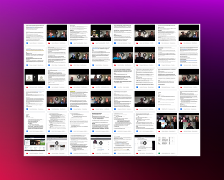
User interviews with open-source software maintainers.
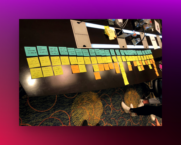
Card sorting and journey mapping based on user feedback.
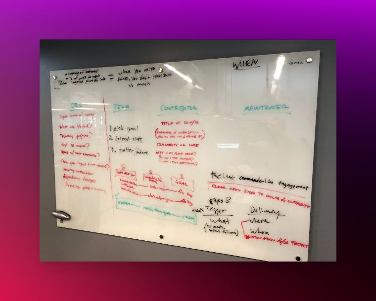
Whiteboarding exercise to better understand user behavior.
Engaging with the Community
To address these challenges, my team began an extensive UX research phase, engaging with dozens of customers to delve into their struggles with the existing notifications system. This effort was complemented by community outreach, which aimed to identify the major pain points around attention management, productivity, and focus amidst the constant influx of GitHub notifications.
Further insights were gathered through quantitative research, including online surveys and analysis of user behavior. This data shed light on the inadequacies of the previous system, particularly its failure to provide sufficient control or context for notifications.
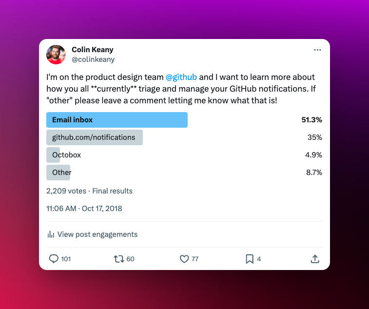
Twitter poll with GitHub community.
Innovating Through Design
Armed with these insights, my team and I embarked on a rigorous process of creating, testing, and refining several rounds of design concepts. Through iterations and prototyping, we developed a user interface that not only addressed the community's concerns but also resonated with them on a practical level. This customer-approved UI represented a significant leap forward in making notification management more intuitive and efficient.
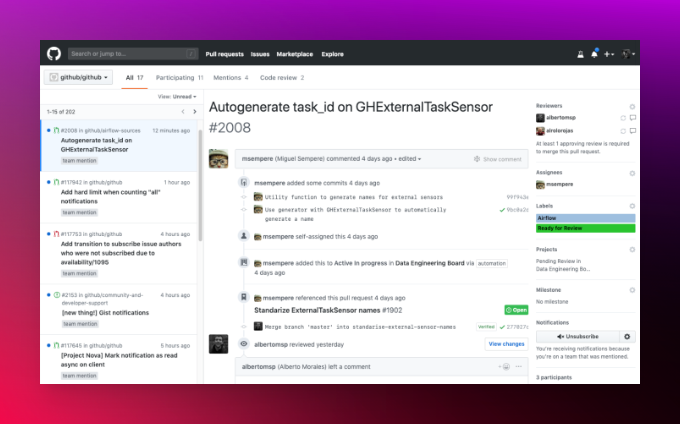
Prototype based on three-column layout concept.
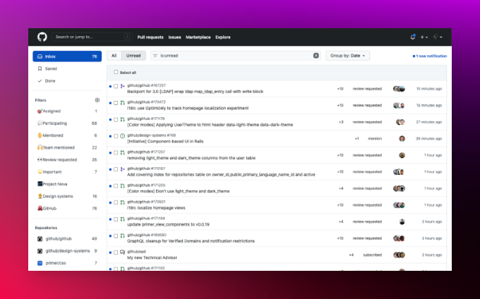
Refined, single-column UI based on user feedback.
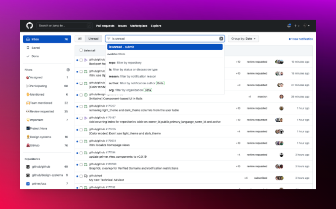
Enhanced filtering for a more customized experience.
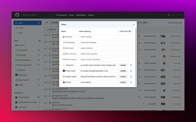
Saved filters for context switching and faster triage.
Measurable Success
Our comprehensive redesign of GitHub's notification system yielded significant improvements in usability and efficiency, directly addressing the challenges faced by developers and maintainers. The initiative's success can be quantified through several key accomplishments, underscoring the positive impact on the developer community:
- Increased Overall Read Rate by ~50%: The revamped notifications interface and improved filtering options resulted in a substantial increase in the overall read rate. This improvement indicates that users are now more likely to engage with notifications, ensuring that important information is less likely to be missed.
- Increased % Read Rate of Direct Mentions by ~48%: Direct mentions, which are crucial for individual attention and action, saw a nearly 50% increase in read rates. This enhancement has made it easier for developers to spot and respond to direct communications, fostering better collaboration and responsiveness within projects.
- Increased % Read Rate of Team Mentions by ~20%: The read rate for team mentions also experienced a significant boost. This increase has enhanced the visibility of messages meant for broader team awareness and action, contributing to a more cohesive project management experience.
- Reduced Average Time to Engagement from 28 Hours to 6 Hours: One of the most striking achievements was the reduction in the average time users took to engage with notifications. By cutting down the response time from over a day to just 6 hours, the new system has made the workflow much more dynamic and immediate, benefiting both maintainers and contributors.
- ~94% Adoption of the v2 Experience During Initial Rollout: The transition from Beta to General Availability (GA) of the version 2 (v2) notifications experience saw an impressive adoption rate of approximately 94%. This high adoption rate underscores the positive reception from the user community and the effectiveness of the redesigned system in meeting their needs.
These key accomplishments highlight the success of our team's effort to revamp the GitHub notifications system. By listening to our users and innovating based on their feedback, we significantly improved the usability of the GitHub notification system and the overall platform.